logo design
Process
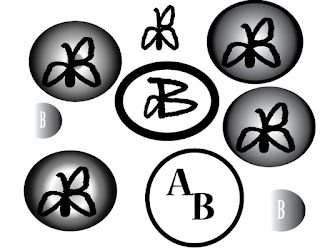 So my first idea for my logo was to have my initials close together either in or to form a shape, and my idea was to have a capital A and then a B would be formed by two triangles inside the A. It turns out it would be hard to since the triangles wouldn't fit inside the triangles the way I wanted so I used the line tool instead. It worked the way I wanted it to but i couldn't change the color so I scratched that idea. My second idea i made while thinking before we went into Illustrator was to have a lower case a and then on the other side a capital B formed by two lower case a's. the idea worked and to make it interesting I changed the font. The logo would then be engulfed into a circle and since the font
 was black i made the colors inside white/grey. The outer part would be a fated black and then would go to grey then whit. I decided that would be my final logo.
Mockups
 Since my logo was grey and black and I used images that weren't so colorful. I used two black shirts, the van, the iPhone and the wall. Since the colors are dark they look good and fit well on the mockups.
Final Logo
 This is the final version of my logo. It has my initials, has a shape incorporated and is decently created.
Mockups
Final Logo


Comments
Post a Comment