CARP Project/ Oz Poster
CARP Oz Poster
Contrast
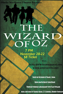
- The text size of the title "The Wizard of Oz" made it so it became the focus of the poster.
- The color of the text of the date, time and price was colored to differentiate it from the other points in the poster.
- The font of the text would appeal to young viewers.
- The bold color of the black for the characters makes it so it stands out more.
Alignment
- The way the title was structured made it so it was centered in the poster.
- The information about the price, time and date was separate from the title.
- The website was separate from the book information.
- The book information isn't as important as the title so it was at the bottom.
- Mostly everything was in the center format.
- Book information is at the bottom and includes everything about the movie adaptation compared to the book.
- The "Visit" section included the gmail and the website to get information.
- The characters were away from the text for the most part.
- The text is all close together.
- Nothing is too far from another.
- There is space in between the text.
- The text that makes sense next to each other that are in the same category and group.
- Every thing is the poster is visually connected and makes sense together.

Comments
Post a Comment